
Now that the year’s two box-office behemoths hit theaters in July, August brings a much more robust line-up of titles to fill in their slowly reducing screen numbers as time passes. Besides this week’s trio of new releases, the rest of the month sees a minimum of five films to expect in multiplexes nationwide every Friday.
Some of these come with existing IP people have been clamoring to revisit (Coyote v. Acme, August 28). Some have existing IP no one expected to still be going (Super Troopers 3, August 7). And others promise fresh thrills that could have easily been shoehorned under the guise of existing IP (The End of Oak Street, August 14) … am I the only one who thinks J.J. Abrams thought long and hard about making David Robert Mitchell’s latest into a Cloverfield property?
And then there are the smaller indies and foreign imports throwing elbows via the below marketing intrigue, which pivots from the usual glossy collages caring more about contractual billing obligations than artistry. There’s something for everyone.
Boxes
Just because it’s “tried and true” doesn’t mean it can’t still be an effective marketing aesthetic. Just ask the designers of the Tony (limited, August 7; expanding August 21) and Late Fame (limited, August 7) one-sheets. The latter was done by Brandon Schaefer and Jump Cut; the former’s credit still eludes me (possibly P+A since they were involved on a couple other iterations). Both highlight a simple photo from the movie taking up the center half of the page with nothing but text on a solid color behind it.
Tony goes stark-white with a sort of zigzag of typography blocks leading us through the page from the cast list in the top left down to the red title in the bottom right. The bright background works as a great counterpoint to the image—it depicts characters in chef whites that look anything but, the lighting and kinetic blurs ensuring we can’t help seeing Dominic Sessa’s face first.
Late Fame goes with a dark-burgundy brown that allows earth tones of the depicted bar scene to merge with it so well that they needed to add a thin white frame to keep us from losing it altogether. Our eyes then process it as a cohesive whole to match the white critic quotes at top and title at bottom. Nothing is lost. Nothing overpowers.
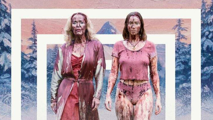
For Mubi’s Teenage Sex and Death at Camp Miasma (limited, August 7), the artist uses their squares to achieve the opposite effect. They want the image to pop… or, better yet, to recede into the background. The thick white bars become an echo onto the photo that manufactures a fake perspective simultaneously pulling the snowy mountain scene backwards and propelling Gillian Anderson and Hannah Einbinder forwards.
It’s a social-media meme technique that people use to easily create depth in a flat image due to what’s left behind the bars and what’s masked to sit in front of them. It’s also a nod to the speaker-like “face” of the film’s slasher known as Little Death. We get the literal with the figurative, the design flourish and the metaphor.
And how can you not love the Friday the 13th-inspired title treatment? It’s so good that they even created a fake VHS collection of potential sequels.

Then there’s To Use a Mountain (limited, August 21) wielding its box motif as a collage to augment their faux informational handbook page complete with punched binder holes. It’s not just the map being used as both image and background or the text like “United States Department of Energy” that keeps things authentic, though. It’s also the subtle bleed through of words and graphics “printed” on the other side of the page.
Talk about detail-oriented.
It’s also just a well-conceived composition that knows exactly how to balance its frame. Whether the tiny rectangles of inset imagery, the decision to center the director’s name in a double-wide gap—yet play with the title to fill its own much wider space—or the tidy collection of logos and a laurel matching the look of the state outline and compass, not a single hair is out of place.
Violence
The poster for American Doctor (limited, August 14) isn’t violent, but it presents violence to its audience. The symbolism of a stars and stripes pattern being filled out with bombs. The aftermath of explosive carnage via blown-out buildings. The juxtaposition of that setting with the tagline “Do no harm.” It’s powerful stuff.
It’s simple, too. Three men walking through those decimated streets with a stethoscope to ensure we know who they are. The gorgeously rendered American flag fading into the gray sky while also serving as a backdrop and pillar housing the pertinent text and logos. Even that lens flare in the bottom-right corner offsetting the bright sun peeking out to provide a semblance of hope. It sticks with you thematically and aesthetically.
The “violence” within the one-sheet for How to Divorce During the War (limited, August 21) is a bit more literal, yet firmly tongue-in-cheek. We don’t know what this man is swinging his shovel at—only that his grip is preparing to do some real damage.

Stacking the type up on the left side of the page is therefore supplying him a target. The credit block at a 90-degree angle forms a wall of sorts that the large red text of the title can extend out from as bricks preparing for impact. It’s a symbol of strength under the threat of destruction, a metaphor for the impending attack on Ukraine by Russia as well as the dissolution of a marriage.
And it’s just an unforgettable layout that excels in its minimalist construction to provide a fun image that works equally as a tease of the film’s subject and a typography clinic. It’s so good that Kino Lorber pretty much left it untouched for their US release beyond adding a few critic quotes at top left. I prefer the original’s white space, but that new text doesn’t ruin what works so well.
With The Robot Eye’s Blood Shine (limited, August 21), we find ourselves looking at the result of violence. Two bodies lying prone on the ground as we view them from above, one has a knife while the other’s arms are outstretched in an embrace. Is the latter in mourning? Is she a victim who just happened to fall in that position? Both?
That’s where the intrigue lies. We’re being asked to speculate upon a story that’s already unfolded while also wrapping our heads around the abstract nature of its geometric symbolism and tagline: “You have been chosen to serve the light.” Because those words seem incongruous with the scene unless we’re to believe “service” means murder.
It’s a mystery rendered with a meticulous eye marrying photography with graphic imagery to create a uniquely cryptic piece that gives off shades of propaganda as much as a warning of danger. Add the title treatment’s uniformity with kinked letters mirrored from the start to the end and it’s like you’re finding something new with every glimpse.
Top to bottom
I love the movement created within Silenzio Communication’s poster for Julian (limited, August 7). If you’re going to separate a word vertically into its letters rather than rotating the whole word 90 degrees, it better possess the utility of leading our eyes through the page with each one as a step. Because we’re not simply falling in an instant—we’re floating downwards to catch the smile born from this embrace.
The soft haze of the red letters. The bisection of the page. The decision to split the credit block into two columns while picking a thin enough font to have the words disappear into the color of the shirt. Everything about the design is intentionally measured as a guide for us to process what we need. The rest is for those willing to venture in further.

Filipiñana (limited, August 28) also goes vertical in its layout, but with a more segmented approach. Adapted from the original international sheet by Adrian Curry, it’s more about stacking its elements than hiding them. Actor portrait. Title. Credits. One, two, three. And then we can go back and see how their respective placements create a whole.
This is a case where I like the revision more than the source. The latter’s decision to put Jorrybell Agoto’s face upside down at the top becomes an obvious choice that matches the many other faces lining the other three edges of the page. By removing those people from the periphery, Curry turns the choice into one of whimsy. We almost find ourselves imagining that this scene at an exotic golf course is a dream spilling out from her head—more about the potential of the unknown than simple utility.
Regardless of anything else, however, that title treatment is gorgeous enough to warrant spending ample time with both posters. The tight kerning. Splitting it into three segments without the clunky use of hyphens. Tucking the tilde into the gap formed between the “L” and the “N.” No notes.
The film that provides the most intrigue for me this month—from the teaser to the final sheet—is It Ends (August 21). This is a textbook case of using the medium as a means of piquing interest via mood and abstraction: catch the audience off-guard and draw them in to find out more.

Dylan Mekhi Smith’s tease is fantastic. It’s at once an overhead view of a racetrack and a throwback to the heavily inked appeal of letterpress art. Because we can see the paper fibers letting the pigment seep into the buff background—little bits of imperfect fuzz presenting the possibility that this wasn’t simply designed on a computer and printed with laser precision.
These curves also double as a ladder, though. Yes, we can wind through the road to link the first four letters of the title to the final two, but we can also slowly climb down the negative space to read each new line of text. Filmmaker. Production parallel. Critic quote. Date. It somehow fills the entire frame while maintaining a minimalist touch.
Eric Abbado’s final sheet brings more gloss into the equation but refuses to let go of the intrigue. The image itself does the heavy lifting by blurring the trees on either side of the road into flattened ribbons of color. Is that car going warp speed à la Star Trek? Is it evidence that we’re caught in a simulation? Maybe it just looked cool. You’ll need to watch for yourself to find out.
